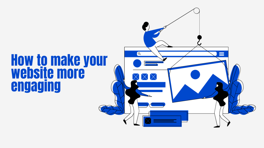
Have you ever been scrolling on Facebook (now Meta) to have an advert for something come up that makes you immediately want to know more about it? Only to find, that once you’ve clicked through to the website, it’s dull, boring, and completely puts you off of the product that you were so interested in to begin with? I’m guessing you’re here because it’s happened to you before and now you’re wondering how you can make your website engaging? How it can be better than those that have misled you in the past.
A website has to make people want to look at it. Take, for instance, a piece of toast. Give someone a piece of toast with a little butter spread on it and well, it’s just a bit of boring warm bread, but give someone a piece of toast smothered in avocado, tomatoes, and a sprinkle of everything but the bagel seasoning and oh my goodness will they get all the vibes from not only how it tastes but also how it looks. This is what you need for your website too!
Keep in mind that you don’t need to overcomplicate things. No one wants to looks at some brightly coloured website with flashing lights in the middle of the night. In the same vein, no one wants to have pop-ups attacking them every few seconds. Don’t go too plain either, remember what we said about the toast. A dull beige page really doesn’t have a lot going on for it. Small pops of colour with the use of photos and images paired with a readable font will get you going in the right direction for a cohesive website that a reader will be happy to spent time on.
Now for the menu. Keep it simple. We see so many websites with menus hidden inside of other menus and it’s just too much. Narrow down what you want for your main menu and work from there. Keeping it to the top of the website will help your readers navigate easily.
Once you’re past having a website that people want to look at, you need to think about how you can get them to interact with it. Have you heard of the all-important call-to-actions (CTA’s)? These are like little magic buttons that can help your website in so many ways. From asking the reader would like to sign up to your newsletter for a discount code and allowing them to do so without having to change pages. To recommending an item that would go with something that is already in someone’s basket or giving them the option to see the newest items in your shop.
To make your website engaging, you need your website to work and work fast. People don’t like sitting and watching the loading wheel spinning and it will put them off if your website is running slowly. This means you need to choose the right hosting package for the job. If you need help figuring out what you need, we are always on hand to give you advice.
For finishing touches, I’d always say to make your website a responsive one. This means that it will work across all devices and look great on them all too. There is nothing as bad as having images looking squashed when you’re looking at a website on your phone.
Stick to these few rules and I promise that you’ll make your website engaging to all of your readers in no time.

